Concept
A Moroccan Hammam is an ancient cleansing ritual rooting back to the idea Roman bath houses, originally a religion-rooted spiritual experience, and as of modern day, a spa-like luxurious treat for the ones wishing to relax and experience something unique in their day-to-day lives.
Name
The word 'Darija' literally translates as 'Moroccan Arabic' referring to the local, 'informal' language, which is characteristically different from traditional Arabic - not unlike how Moroccan Hammam somewhat differs from Hammam in other Arabic countries.
Interior Design
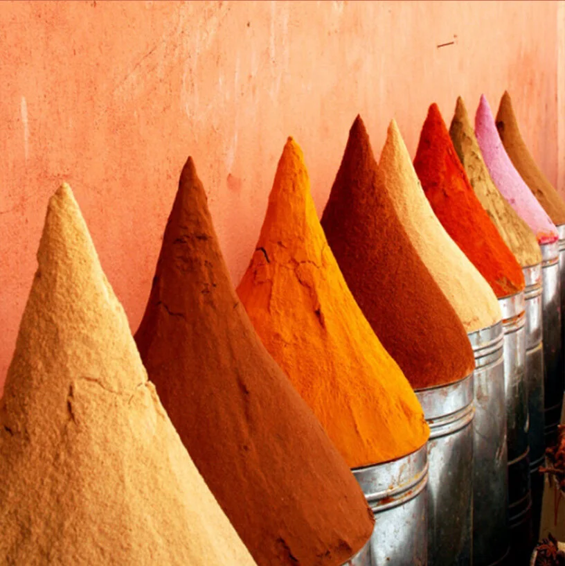
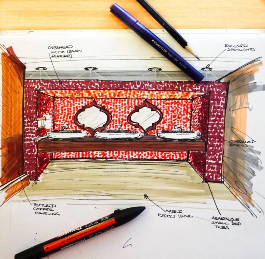
The space is segmented into 5 different areas: reception, treatment rooms, relaxation lounge, hammam and bathrooms. With a mixture of both private and shared zones, the spaces have a centralised organisation, honing in around the hexagonal, relaxation lounge- with the other areas jutting off. The zoning of the space was very much inspired by traditional girih Islamic patterns and geometry. The design concept is reminiscent of traditional Moroccan architecture, in its geometry and symmetrical features- however modern features are brought through in the materiality of the scheme. The traditional hammam marble is juxtaposed with new contemporary tiling, and refined copper lighting that is scattered throughout the space. A rich, warm palette takes over the hammam-scape. Reds and burnt oranges are taken from the mountains of spices found at the Souks of Marrakech, in order to create a sensual, palatial interior space.
Branding
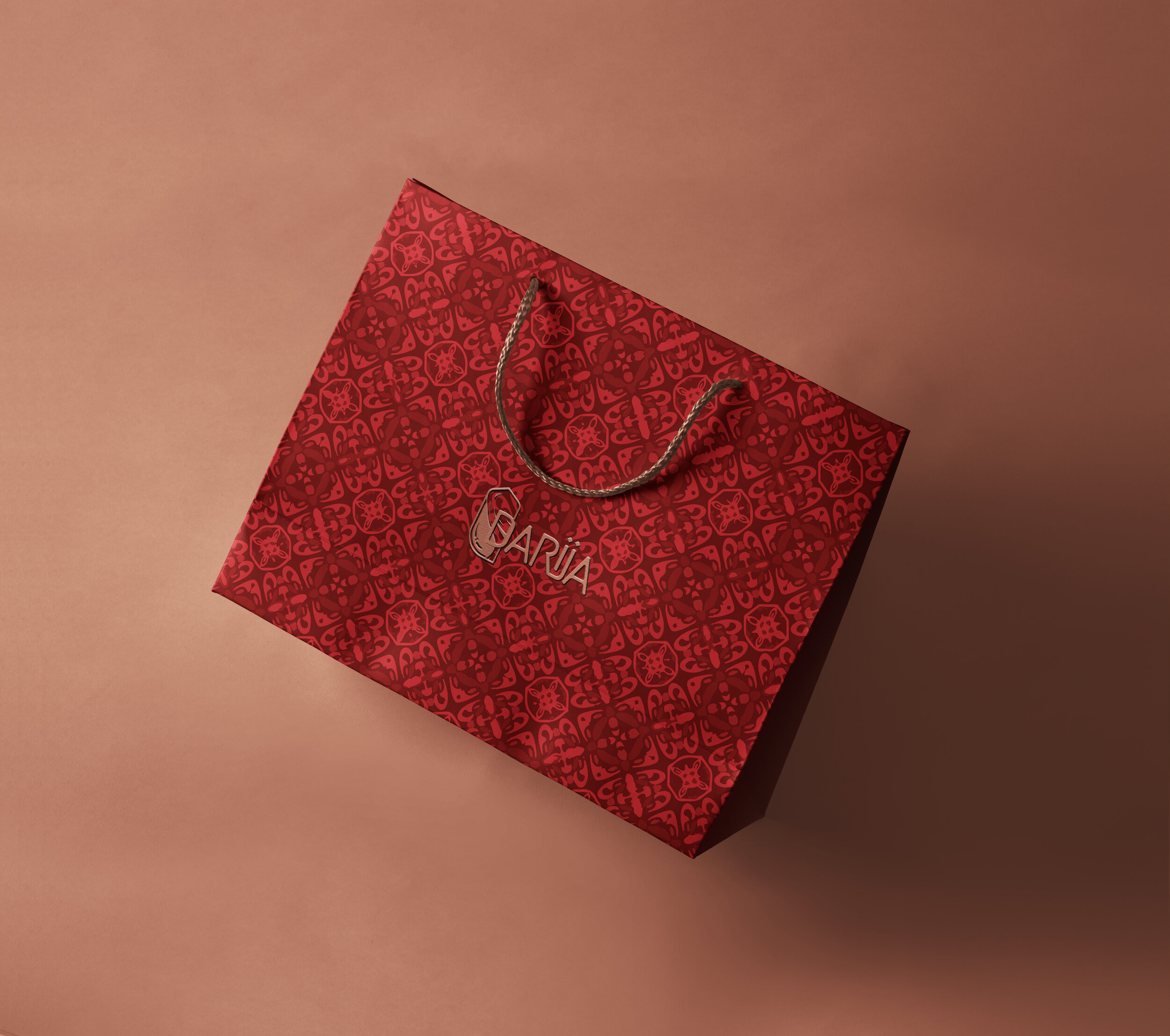
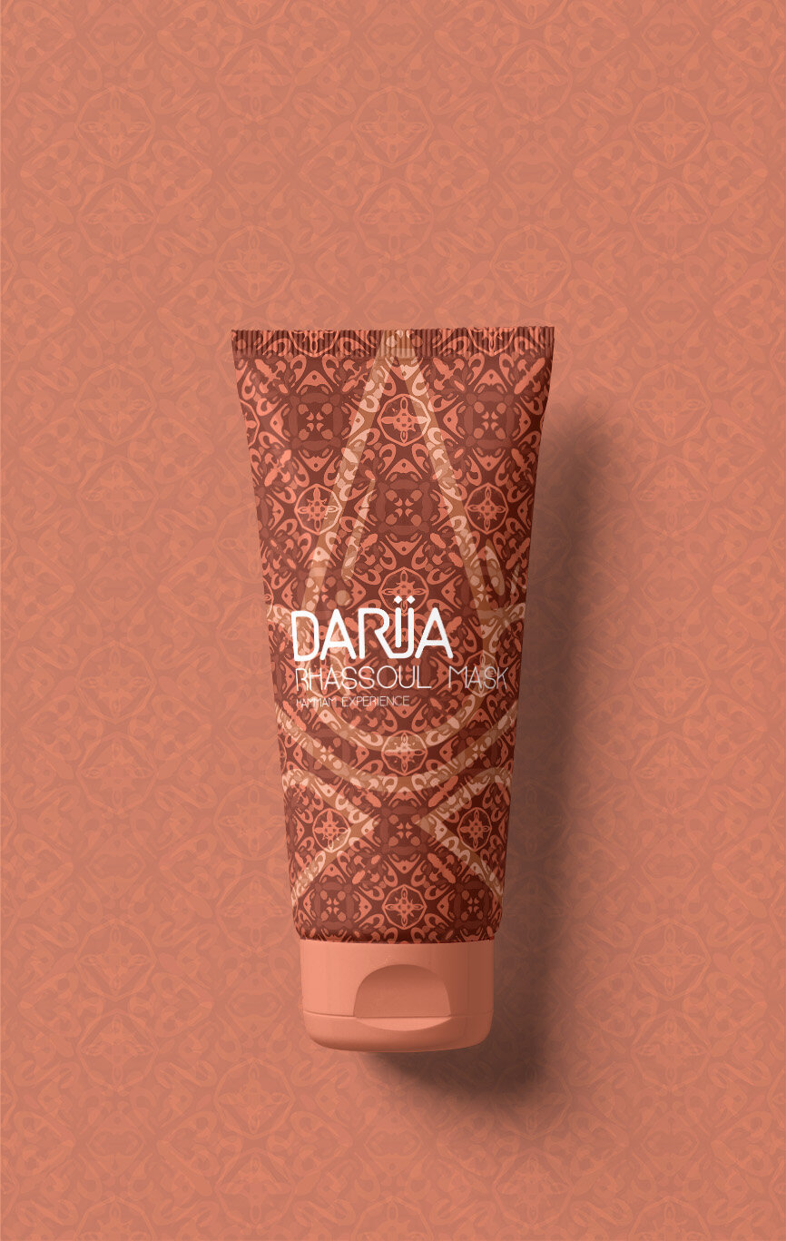
With the overall brand's feel, we wanted to create a visual style that bonds well with the Interiors - using the same red/copper/sandy colour palette, we have drawn up a figurative and a typographic logo as the main branding elements are aiming to feel luxurious, yet authentic and traditional. The logo, this marriage of the Arabic window, water, and this colour palette aims to take a moment or two from the viewer to decode that adds to the mysterious nature of the Arab World. Carrying the colour palette forward to textures and patterns, we have created a bold, arabic-looking girih pattern design that is heavily featured as the bases of all marketing materials. The patterns are bold but imperfect, and look a bit weary to indicate this brand roots back from the ancient times...


