Concept
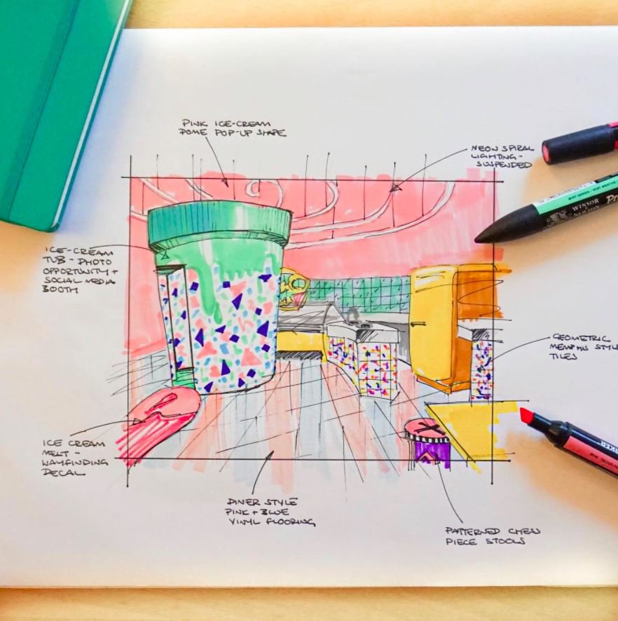
This was a brand experience for a new product launch. Sprinkler, an 80's inspired ice-cream brand challenged us to design a pop-up shop for their public debut as a brand, as well as including us in the full brand creation process.
Name
Sprinkler borrows its name from an infamous dance move, to reference the brand's sense of silly 80's fun, it is aiming to represent, as well as referring to sprinkles you would get as a condiment on your ice cream.
Interior Design
The space is formed under an ice-cream-like melting dome structure, with a radial organisation determining the furniture- much like a swirl of chocolate syrup. The interior is zoned into 3 main areas: ice-cream parlour, diner seating and Instagram photobooth. The design concept takes inspiration from the infamous Memphis design style - a stylistic movement that emerged from the 80's/90's, as a rebellion against the rules of design. Users are able to interact with the delicious products whilst enjoying 80's Synthwave music. Motifs taken from prolific 80's/90's television like: Fresh Prince of Bel Air, Miami Vice and Knightrider are seen in the entirety of the space. Bubblegum, pastel tones take over the scheme to create a fun, playful aesthetic. As well as bold colours, odd shapes and mismatching patterns to create a fun & fresh looking brand experience.
Branding
Naturally to match the fun and bold interiors, we went with unexpected graphic choices to create this brand. There is no official 'logo' per say; the logomark looks slightly different in different uses. The two main fonts we have included have nothing in common, and everything is wildly colourful and shouty - to name a few examples of style choices. All elements refer back to the core idea behind the Memphis movement, which we felt like was the perfect style guide to complement a fun, new ice-cream brand.
“Memphis’s fresh approach to design, which was characterised by creativity and humor, came to be a lasting stylistic hallmark of the 1980s. ”


